Financial well-being is often confusing, inaccessible, and fragmented.
1. People rely on multiple apps for tracking, products, and advisors.
2. Trust and clarity are missing.
3. Manual effort in tracking & document sharing discourages adoption.
FinCheckers wanted to change this by delivering financial well-being as an integral part of everyday life.

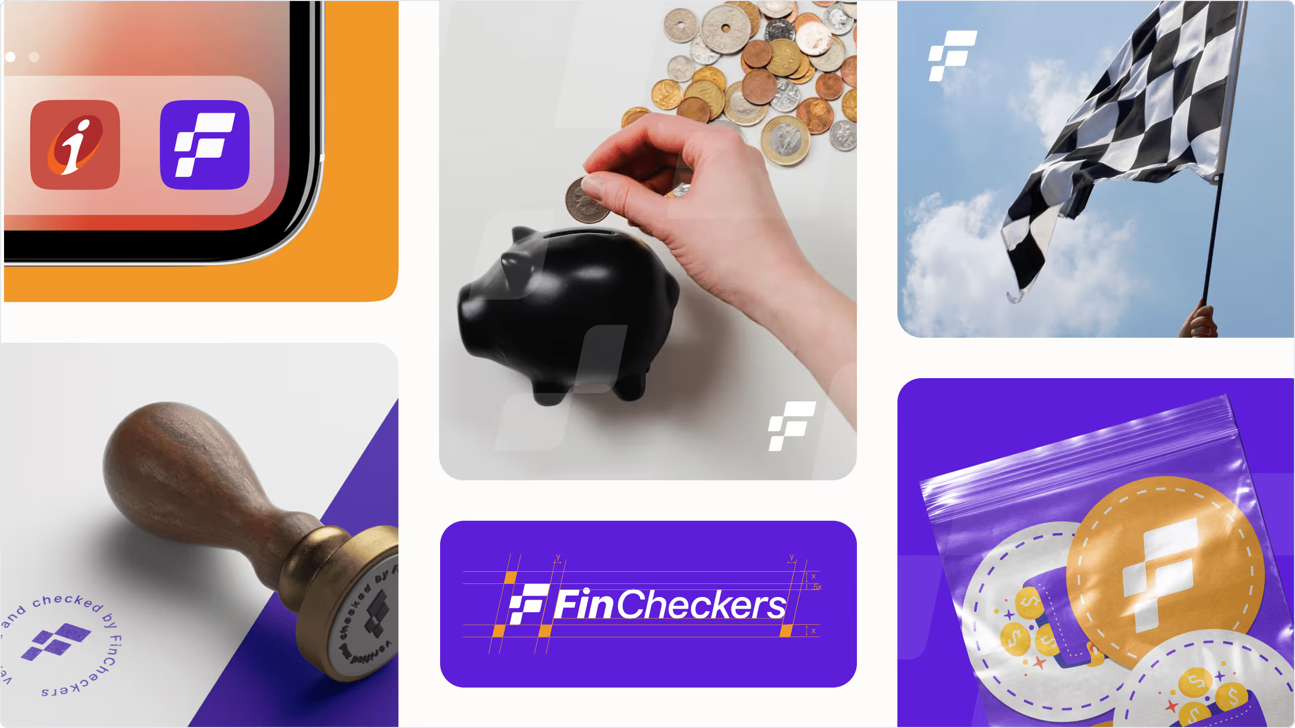
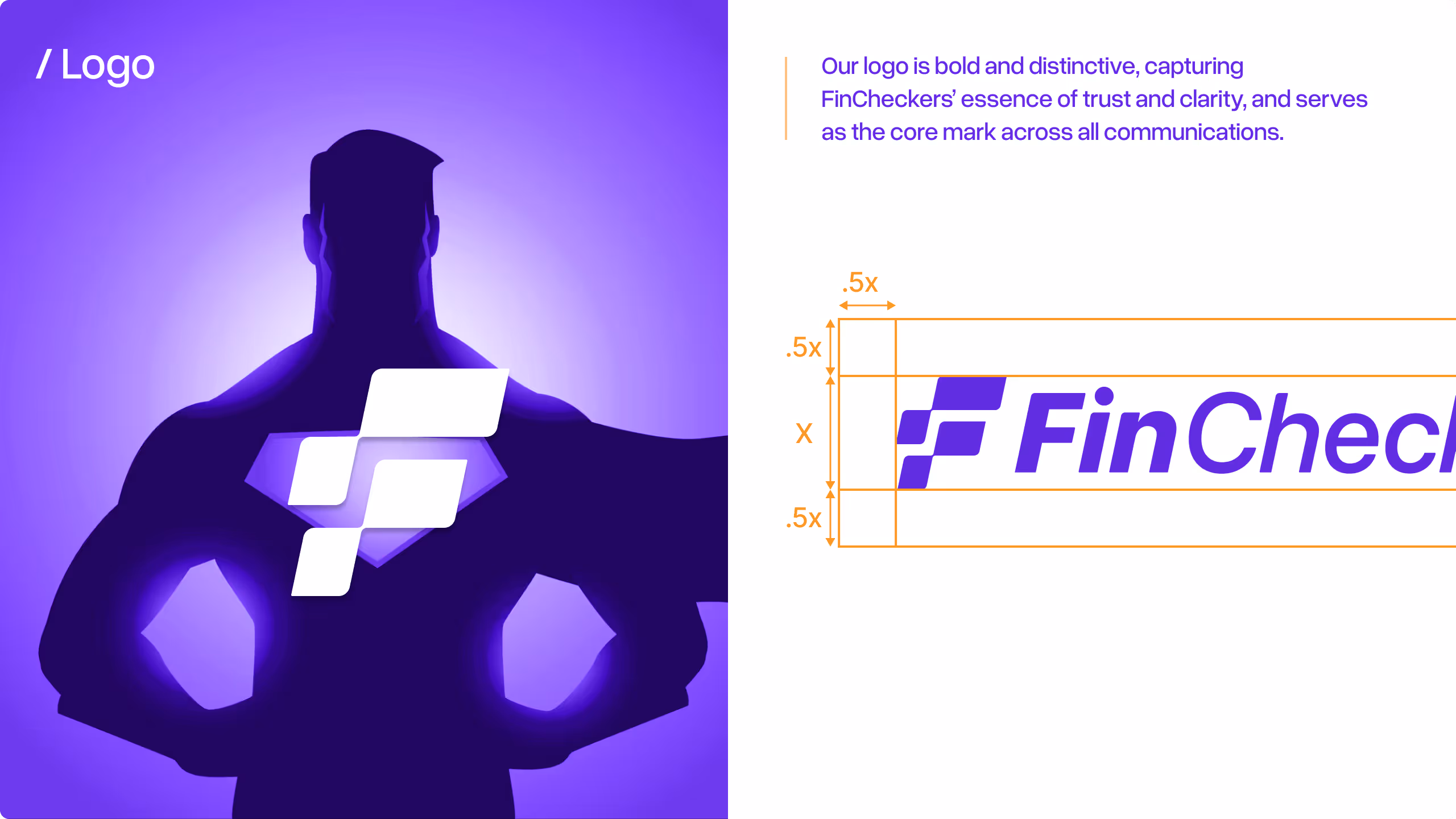
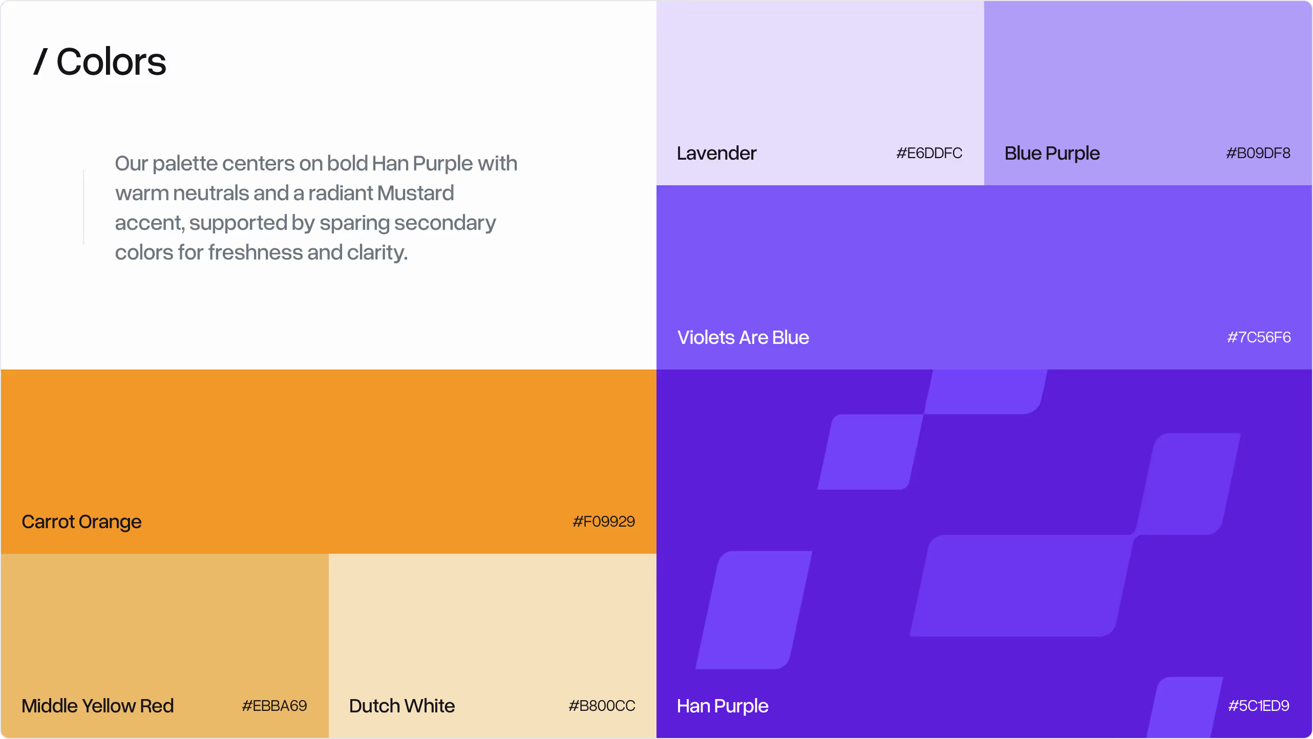
We created a visual identity that made finance feel trustworthy yet approachable. A bold FC Purple anchored the brand, paired with clean typography, a grid system, and 90+ custom icons to simplify complex concepts. The result was a consistent, modern design language that turned intimidating finance into something clear and actionable.

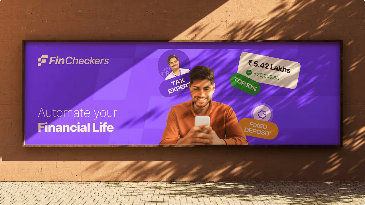
We brought the FinCheckers brand to life through a mobile-first app designed to make finance simple, clear, and approachable. Below are the key screens showcasing how our design system translates into the product experience. We focused on 3 major areas: finding the right financial product, chat with the financial experts, one dashboard to track it all.


The MVP received highly positive initial feedback, with users appreciating the intuitive UI/UX and cohesive design language. The branding was applied consistently across multiple touchpoints, strengthening recognition and trust. Overall, the launch was considered a strong success, validating both the design approach and product strategy.