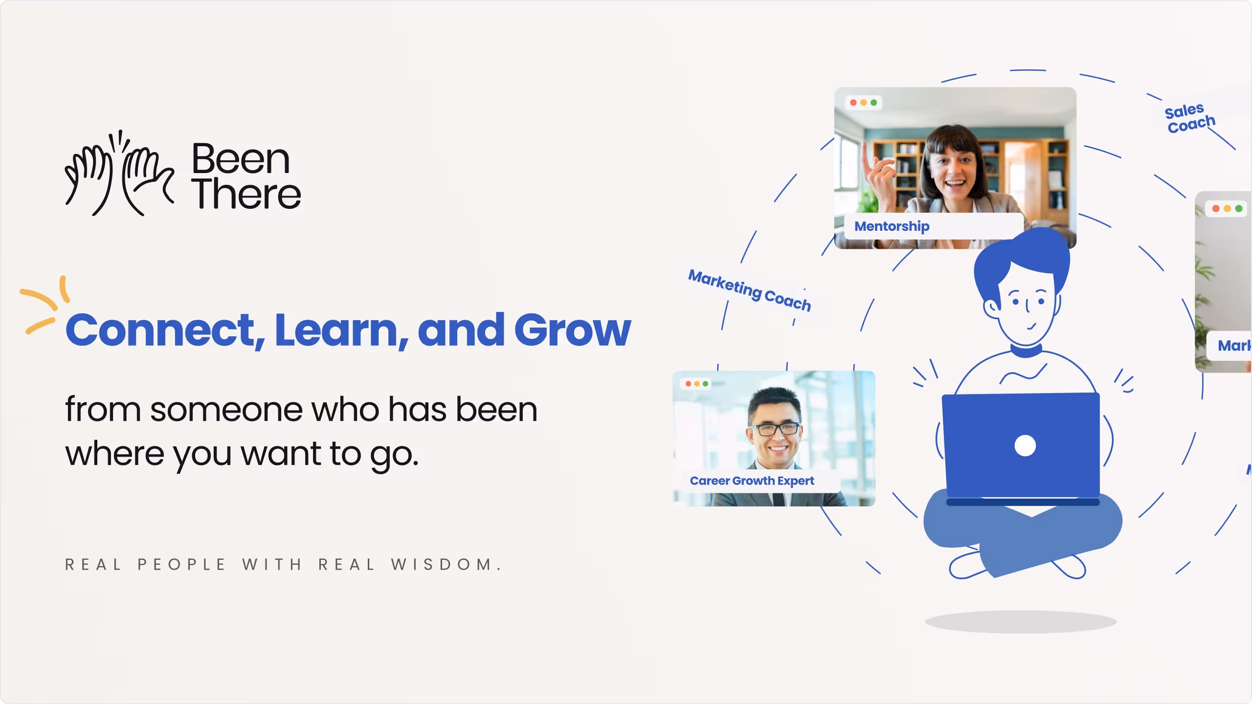
How do you build a brand that feels equally relevant to
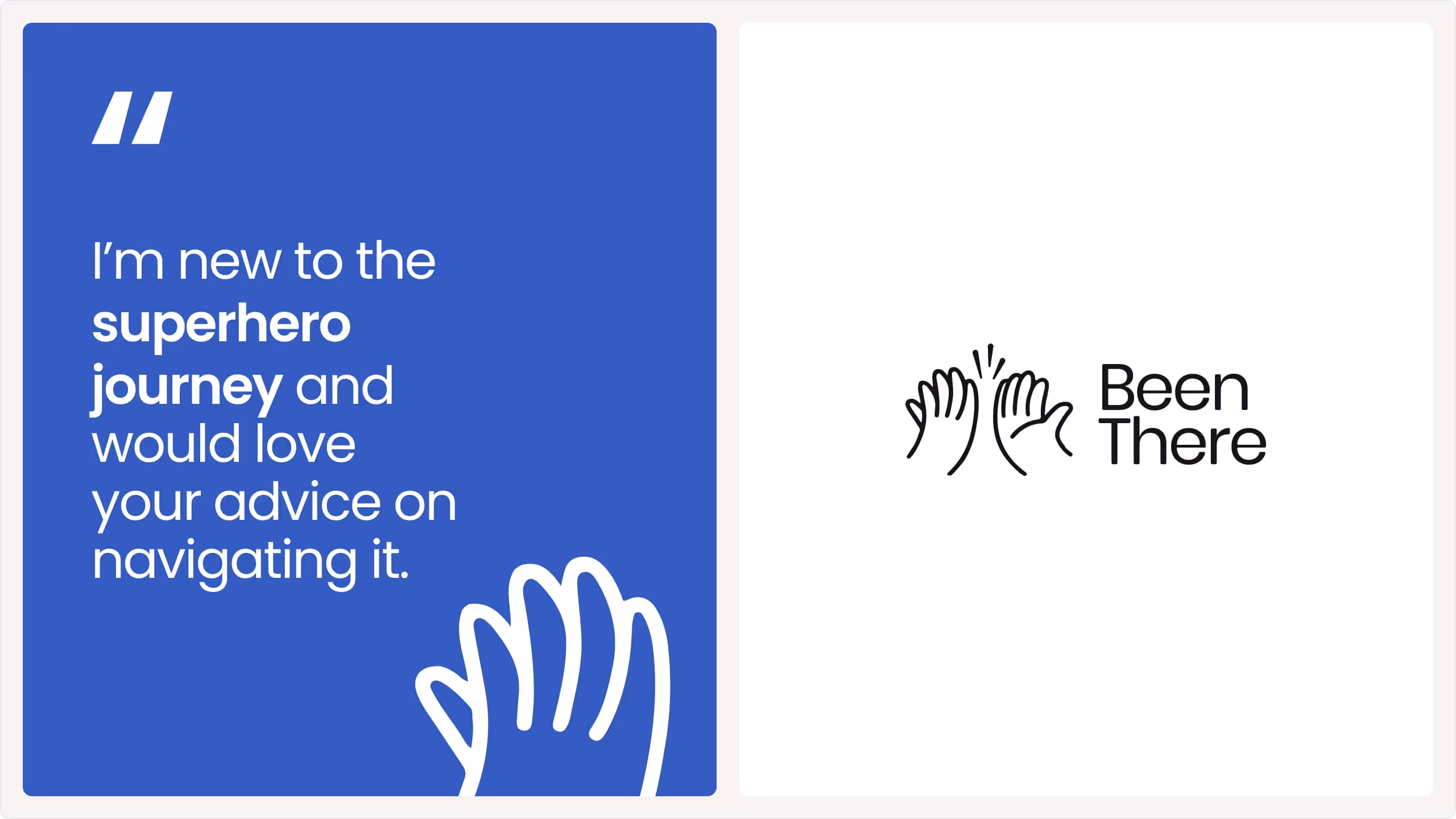
Seekers → people navigating challenges and looking for guidance.
Sharers → people willing to contribute their wisdom to help others.
The design needed to be approachable yet credible, standing out in the crowded edtech/knowledge-sharing space.
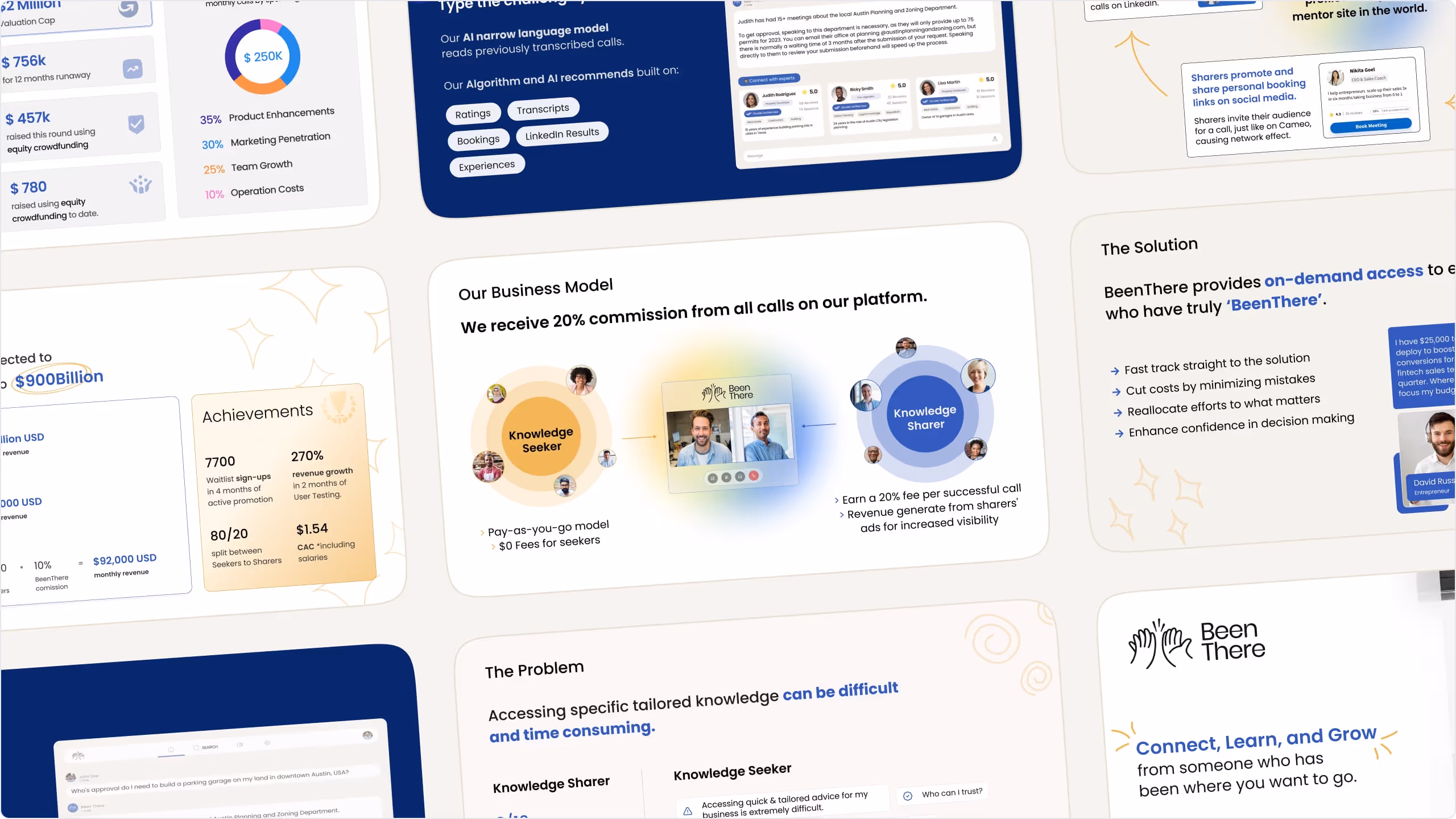
Crafted a visual system around openness, connection, and human growth.Balanced professional credibility with approachability through color, typography, and illustrations.Built clear, engaging digital touchpoints to explain the platform and excite investors.
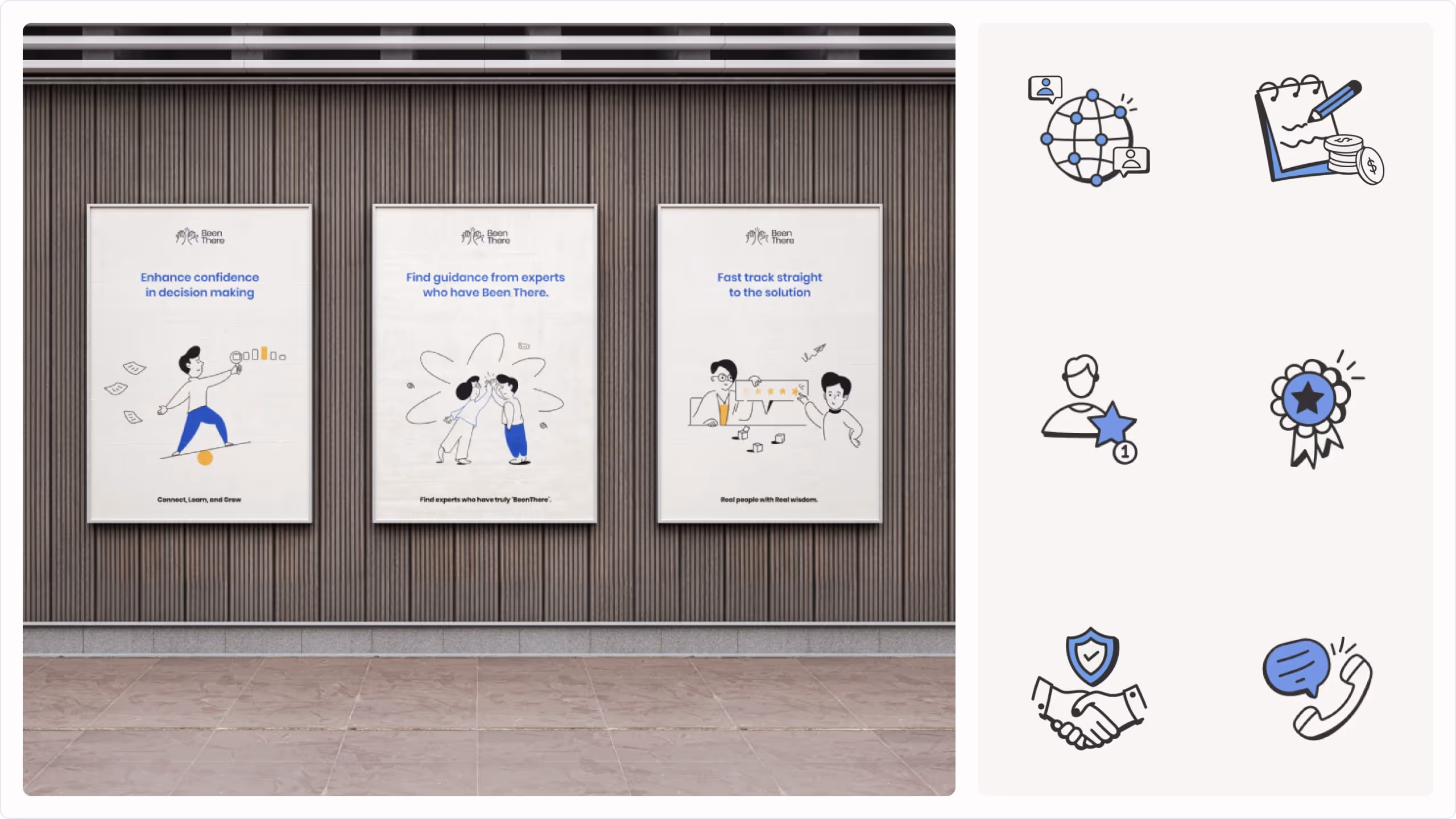
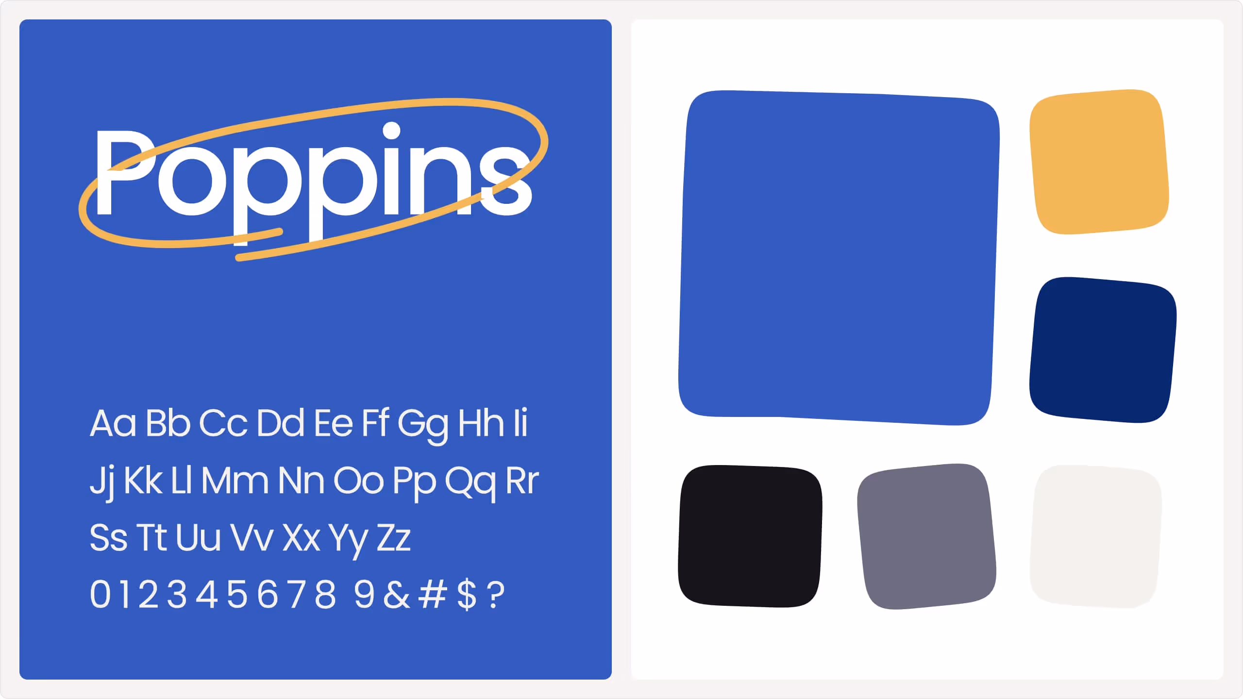
A “high-five” mark representing connection, collaboration, and mutual growth. Poppins for a clean, modern, and friendly voice. A warm palette of blues, neutrals, and gold accents symbolizing trust, inclusivity, and wisdom.Playful yet professional, reinforcing human connection.
A unified brand system that positions BeenThere as an approachable, credible, and scalable knowledge-sharing platform.
The refreshed identity enabled BeenThere to confidently pitch to investors and connect with early adopters through a clear and engaging digital presence.