
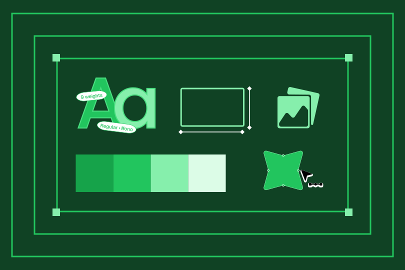
You are not going to produce what a studio would. You can produce something coherent, and coherent beats decorated.
Start with type. It carries more feeling than colour and you'll live with it in every asset forever. Getting this right fixes half the problem before you touch anything else. Pick one family with enough weights to build a hierarchy.
Build colour as a hierarchy, not a palette. What's the 80% colour, what's the accent, what appears twice a year. Eight colours with no rules is eight ways to be inconsistent.
Do the wordmark, not a symbol. Symbols need years of fame to mean anything. A well-set wordmark works on day one. You can add a mark later, once people know who you are.
Choose one signature element. A repeated shape, a way of cropping images, a rule, a grain, a specific corner radius, a motion behaviour. One thing that appears everywhere and belongs to nobody else. This is the piece doing the uniqueness work.
Test where it breaks, not where it shines
Every identity looks good on a large white slide with nothing else on it. That tells you nothing, and it's how most identities get approved.
Put it somewhere hostile instead. A dense pricing table. A mobile screen at minimum size. A slide from the back of a room. An error state. An invoice.
Systems fail at the edges, and the edges are where buyers spend their time. If the identity holds up on an invoice, it'll hold up anywhere.
